Featuring: Watcher Release: December 9, 1963 Cover: March 1964 12 cents Story plot: Stan Lee Script and art: Larry Lieber Inking: G. Bell Lettering: S. Rosen 5 pages
In general, these science fiction tales are a poor fit for the Marvel Universe. They do better as standalone stories. Within the context of the Marvel Universe, a scientist wouldn’t be desperately trying to prove there are advanced alien civilizations out there… we already know that because dozens have invaded Earth.
We know the Watcher is part of the Marvel Universe, and he claims to be telling us a story of the future. But perhaps it is not the future of our Marvel heroes. Perhaps it is another future, maybe even our own. It is set in the far-off 21st century.
Featuring: Iron Man Release: December 9, 1963 Cover: March 1964 12 cents Written by: Stan (When does he sleep?) Lee Illustrated by: Don (When does he eat?) Heck Lettered by: Art (When will he learn to spell?) Simek 13 pages
Stan notes we are probably wondering how a Scarecrow can cause Iron Man any trouble. I was wondering exactly that, Stan. In fact, I often wonder why most of Iron Man’s villains cause him any trouble. This issue will not answer the question. Iron Man strikes me as far more powerful than you make him out to be.
We get a somewhat interesting origin for a super-villain. It begins with Iron Man making a joke that he’s glad the performer is not a criminal, which inspires the performer to be a criminal. All he needs now is to steal a Scarecrow costume from a costume shop and some trained crows from a colleague.
Those who engage in humor know it to be an art form not free from consequence; we maintain that the rewards, though subtle, are worth the risk.
Featuring: Watcher Release: November 12, 1963 Cover: February 1964 12 cents Story plot: Stan Lee Script + art: Larry Lieber Inking: S. Brodsky Lettering: Art Simek 5 pages
The Watcher tells a tale of the distant future, the 21st century.
Wilbur Weems is a shy space pilot, teased by everybody for his general wimpiness. Having no friends or family or much of anything, he volunteers for an apparent suicide mission to investigate a cosmic dust cloud.
Featuring: Iron Man Release: November 12, 1963 Cover: February 1964 12 cents Written by: Stan Lee Illustrated by: Don Heck Lettered by: Ray Holloway 13 pages
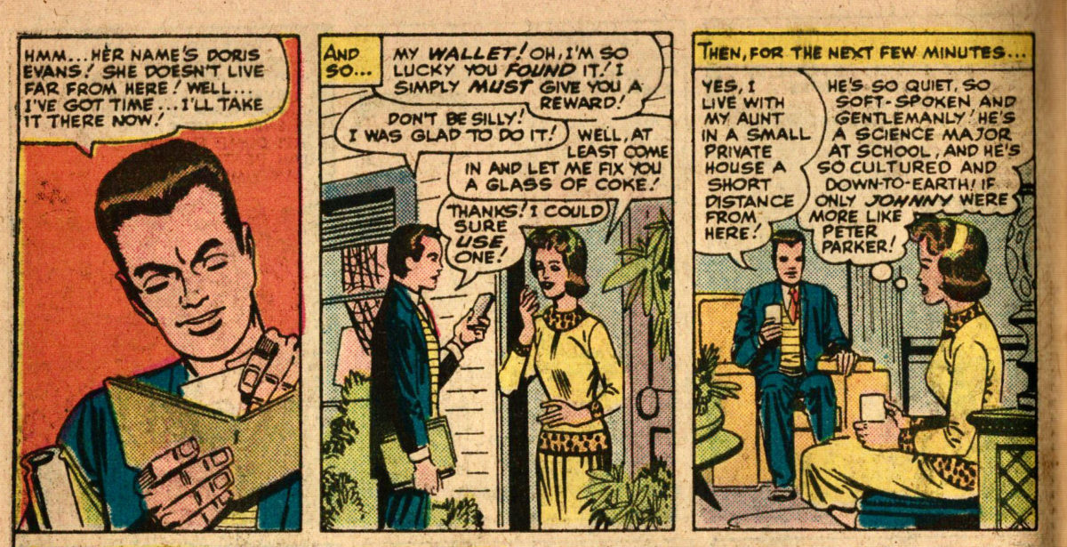
So there’s this idea of an archfoe. Not every superhero needs one, but most have one. For Superman, it’s Lex Luthor. Batman has an extensive rogues gallery, but Joker stands out amongst them as his archfoe. We have not yet met Green Goblin, but many consider him Spider-Man’s archfoe. That’s likely why he was the villain in the first Spider-Man film. Those people, including the filmmakers, are wrong. We have met Spider-Man’s archfoe. It’s Dr. Octopus.
Thor has fought Loki in almost every issue. Magneto showed up in X-Men #1 and will be showing up a lot more. The Fantastic Four have fought Dr. Doom in a full quarter of their issues.
For Human Torch, it seems to be the Wizard. For Ant-Man/Giant-Man, it’s a little less clear. I tend to point to Egghead, others to the Human Top.
In this issue, Iron Man meets the Mandarin. He’ll be showing up again in a few issues. And conventional wisdom suggests Mandarin is Iron Man’s archfoe. I have no idea why conventional wisdom suggests that. I just don’t understand and never have.
Mandarin is a “yellow peril” villain, part of a long tradition of villains, with the most eminent one being Fu Manchu. Within Marvel, they had the Yellow Claw back in the 1950s. We’ll visit his old stories when he reemerges in the modern era. Today, by modern standards, this tradition of villains is considered racist. They are stereotypes of Asian people, which feed and draw from the prejudice that many Americans feel toward the people of various Asian countries. This prejudice is rooted partly in government propaganda, going back to the war against Japan, and continuing with the Cold War against Communist China, with this xenophobia enduring to the present day.
Featuring: The Watcher Release: October 8, 1963 Cover: January 1964 12 cents Story plot: Stan Lee Script and art: Larry Lieber Inking: G. Bell 5 pages
“The Saga of the Sneepers” is the type of story that’s occupied this title since before Iron Man showed up, and has continued to exist in the form of backups to the main Iron Man stories. The difference between this and the ones we’ve opted not to read is that the Watcher is narrating it. That is the format of the first of these “Tales of the Watcher” stories.
The same format showed up this month in Tales to Astonish with “The Wonderful Wasp Tells a Tale“. The Watcher seems a more natural narrator of science fiction tales than the Wasp. The Wasp seems like she should be living adventures. The Watcher is forbidden to interfere in events, so narrating the events he observes is a more sensible use for the character than what he’s done in his two Fantastic Four appearances: interfering in events.
A notable difference between the two is that Wasp was presumably spinning a fictional story about the future to entertain, whereas the Watcher is narrating actual events. So the Sneepers are an actual alien race within the Marvel Universe; the Wobbows likely are not.
Featuring: Iron Man Release: October 8, 1963 Cover: January 1964 12 cents Written by: Stan Lee Illustrated by: Steve Ditko Inked by: P. Reinman 18 pages
Paul Reinman on inks. It’s not often Ditko gets an inker. He usually does his own finishes. His first Iron Man story had Don Heck doing “refinement”. I think that’s the only other time we’ve seen anybody else finishing Ditko. Paul Reinman has been inking the X-Men comics, so he may be here to help keep their faces on-model.
Once again, that weird note at the beginning; we’ve seen something similar in every crossover. Stan thanks the editors of X-Men for letting the characters appear. You are the editor, Stan. But there may be legal reasons for this. Martin Goodman played all types of crazy games with shell companies and such to save a buck here and there.
The idea is it’s all one continuity, one universe. That’s why we read these comics together. But we don’t know that any character is part of that continuity until they cross over. At first, crossovers were sparse. It was a while before there was any hint Iron Man and Thor might be in this world. Crossovers have become increasingly common. After only two issues of X-Men, we learn they are a part of this world. The main story is a battle between Iron Man and Angel, but all the X-Men and Avengers will also show up.
Featuring: Iron Man Relese: September 10, 1963 Cover: December 1963 12 cents Written by: Stan Lee Art: Steve Ditko 18 pages
Iron Man gets a new look.
Steve Ditko is the artist on this issue. Jack Kirby drew the cover. Covers were often completed first. Most internet sites claim Ditko designed the new armor, but it might have been Kirby. These questions have been the subject of decades of debates and lawsuits. I do not know what is true, though I have my guesses.
I do know this new armor is better than the old one. I also know Ditko is responsible for the quality storytelling in the interior.
I also know that Mr. Doll looks much more like a Kirby villain than a Ditko villain. Simple color scheme. Weird headgear. All seems trademark Kirby.
Also, he has a dumb name. The GCD informs me Mr. Doll was supposed to be named Mr. Pain. That’s slightly better, I guess.
Featuring: Iron Man Release: August 8, 1863 Cover: November 1963 12 cents Written by: Stan Lee Interpreted by: Steve Ditko Refined by: Don Heck 18 pages
Interesting credits this issue. “Interpreted by”, “Refined by”. But more interesting than the colorful descriptors used is the name of the person doing the interpreting: Steve Ditko. Currently the artist on Marvel’s two best series: Spider-Man and Dr. Strange. Iron Man has not been very good. Can Ditko turn it around?
Short answer: yes. Long answer: Probably not in a single issue. This is probably the best Iron Man story since his first appearance, but the character still hasn’t reached his potential. And he won’t while wearing that clunky costume…
Featuring: Iron Man Release: July 9, 1963 Cover: October 1963 12 cents Story plot: Stan Lee Script: R. Berns Art: Don Heck 13 pages
The cover bears a resemblance to the Ant-Man cover we just examined. The hero and villain are not actually in the same picture, with one confined to a separate panel.
Get it? “Shocked”.
Professor Vanko is Russia’s top scientist. He has built a suit that makes him master of electricity, the Crimson Dynamo. By the end, Tony Stark tricks him into defecting to the West.
Featuring: Iron Man Release: June 11, 1963 Cover: September 1963 12 cents Story plot: Stan Lee Script: R. Berns Art: Don Heck 18 pages
We meet a new villain, Jack Frost. His special suit covers himself in ice and he can freeze people. He isn’t the first ice-themed super character and won’t be the last. Though off the top of my head, I am not thinking of any earlier examples within Marvel. Over at DC, we met Captain Cold in Showcase #8 (1957) and Mr. Zero in Batman #121 (1959).
But Jack Frost is something of a footnote in the Marvel Universe. This is the first of 6 stories he’ll appear in, making him the most significant Iron Man villain we’ve met, but still not all that significant.
The bigger news is that Iron Man gets a supporting cast!
The writers must know that having a supporting cast is a good idea. This isn’t new. Superman has had Lois since his first issue. Jimmy and Perry followed eventually. Batman has had Alfred for a couple decades at this point. It’s just not a new concept. And it’s working really well for Spider-Man. Aunt May, J. Jonah Jameson, Flash Thompson… they help make the book. But the other stories have mostly not bothered with the concept. Thing has Alicia and Thor has Jane, but that’s the extent of it so far.