Featuring: X-Men Release: March 4, 1965 Cover: May 1965 12 cents X-traordinary script by: Stan lee X-travagant art by: Jack Kirby X-ceptional inking by: Chic Stone X-emplory lettering by: Artie Simek 20 pages
The basic tension of the series is that every mutant that comes along, Magneto wants to recruit them to be evil. And Professor X wants to recruit them to be not evil. General agreement that no third option is acceptable; every mutant must join either the X-Men or Evil Mutants. When Blob tried to do neither, the X-Men attacked him and tried to mindwipe him. The only fine print there is the word “mutant”. Occasionally, someone such as Ka-Zar turns out to not be a mutant, in which case they are not obligated to join either team.
Now we meet a man who describes himself as a Stranger. He is very powerful. Is he a mutant? If so, they must recruit.
Featuring: Human Torch and Thing Release: April 8, 1965 Cover: July 1965 12 cents Soul-stirring script by: Stan Lee Breath-taking art by: Bob Powell Eye-popping inking by: Wallace Wood Heart-rending lettering by: Artie Simek 12 pages
All good things must come to an end. And so must this.
Hulk’s series only lasted 6 issues. But then he started showing up all over the place. Avengers, Fantastic Four, Amazing Spider-Man, and finally he got his own series back, this time to last for over 50 years and counting.
The Wasp had a back-up feature in Tales to Astonish behind the main feature she shared with Giant-Man. It started with her narrating science fiction tales, but then she started going on her own adventures. They were short-lived; she was the second character to lose a series.
The Watcher had a back-up feature behind the Iron Man stories in Tales of Suspense. It started with him narrating science fiction tales, but then he started going on his own adventures. They were short-lived; he was the third character to lose a series.
This month, two long-running features get cancelled. We’ll talk about the other in due course. (We’re reading this one a little early to get the Fantastic Four chronology in line.)
For the moment, let’s reflect on the history of Strange Tales…
Featuring: Human Torch and Thing Release: March 11, 1965 Cover: June 1965 12 cents Written in the magnificent Stan Lee tradition! Illustrated in the majestic Bob Powell manner! Inked in the magiloquent Mick Demeo style! Lettered in the mortgaged Sam Rosen home! 12 pages
Due to the tightness of forthcoming FF chronology, we are reading ahead a bit in these Human Torch stories. Since Dr. Strange is still involved in a big saga, we are still holding off on reading Dr. Strange stories.
Dr. Strange at last gets half of the cover, but Kirby’s work here doesn’t quite do justice to the tale Ditko is spinning inside.
Stan notes the story will start in the middle. That is unusual for one of these stories, but it’s a classical storytelling technique, en media res.
This issue promises a surprise twist, an old villain in a new guise. I don’t want to spoil the big surprise.
Featuring: Human Torch and Thing Release: February 11, 1965 Cover: May 1965 12 cents Edited with reckless abandon by: Stan Lee Written with daring bravado by: Larry Ivie Drawn with brash impetuosity by: Bob Powell Inked with reckless vigor by: M. Demeo Lettered with a soggy penpoint by: S. Rosen 12 pages
Dr. Strange gets a small box on the cover to acknowledge his story.
Yesterday was the 60th anniversary of the publication of Fantastic Four #1. Wish I could have timed my posts to have something better than this Human/Torch Thing story to celebrate with. So it goes. Happy birthday, Foursome!
Art by Alex Ross, inspired by Jack Kirby.
Lots to unpack from the credits page.
We’ve already met Mr. Demeo (Mike Esposito), as he also picked up inking on Iron Man this month.
Larry Ivie is a new name to us. He is an occasional comics writer and artist, and perhaps best known as a comics fan.
The blog, Professor H’s Wayback Machine, recently did a tribute series to Ivie’s work on his self-published fanzine, Heroes & Monsters.
This is the last we’ll see of Ivie for some time, but he’ll do occasional Marvel work here and there over the next couple decades.
Also unusual in the credits is a comic Stan Lee takes no writing credit on. This isn’t the first time, but it’s been a rare occurrence, and will become less rare. Stan still gets his name first in the credits somehow.
What we would today call editing is certainly a contribution that Stan makes to every one of these books, and not one to be taken lightly. The issues arise on the comics where he worked as an editor but credited himself as a writer.
Things are heating up in the Fantastic Four book, and there won’t be much space for solo adventures. So far, with only a few exceptions, Fantastic Four adventures have fit into a single issue, where one could easily imagine these Human Torch stories fitting in between the issues. But, as is the general trend these titles are taking, Fantastic Four stories are going to get more involved, with cliffhanger endings which lead us right into the next issue.
To that end, we’re going to knock out the next few Human Torch/Thing stories presently, getting us a little ahead with them. We’ll eventually revisit all these comics and read the Dr. Strange stories.
Thus subjecting myself and you to three of these in a row.
Featuring: Spider-Man Release: February 11, 1965 Cover: May 1965 12 cents Mighty script by: Stan Lee Powerful art by: Steve Ditko A lotta lettering by: S. Rosen 20 pages
I declared last month’s cover the best we’ve yet seen. Two months earlier, I’d declared it that cover. I really don’t want to keep doing that, but man, look at that crazy cover. It brings to mind Ditko’s roots in weird horror tales, and captures some of the madness of his Dr. Strange work.
The comic more than lives up to the cover.
The opening splash is also excellent. It shows Spider-Man haunted by the same ghost images of his villains, but makes it clear that’s a psychiatrist’s office, and it’s Spidey in the chair. And from the look on the doctor’s face, not about to receive a favorable diagnosis regarding his mental stability.
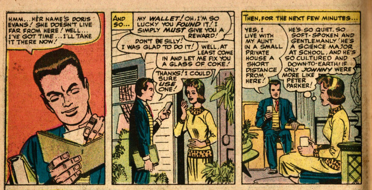
Aunt May is still struggling with the bills, and Peter plans to make more money taking pictures of Spider-Man to help out. Remember the theme of responsibility. Most often, it’s assumed his responsibility is to do good as Spider-Man, but he also has a responsibility to his aunt.
Featuring: Captain America Release: February 12, 1965 Cover: May 1965 12 cents By: Stan Lee and Jack Kirby Inking: Chic Stone Lettering: S. Rosen 10 pages
As with the last twoissues, this is closely based on a story from Captain America Comics #1. As with the last two issues, Joe Simon is not credited.
We at this point are well versed in the Red Skull stories of the 1940s and 50s. We are now primed to see the modern take on the Red Skull, beginning with this retelling of his first adventure.
There are significant changes, many with the effect to sanitize the story, make it less violent and more kid-friendly. For example, in this version the Red Skull is not a killer. The plot of the original was all about him murdering people.
I’ll note the shared story beats common to the stories.
The story begins with Private Rogers and Mascot Barnes escorting Major Croy. They warn him it’s not safe to be alone, but he dismisses them any way.
The Red Skull attacks Major Croy.
Red Skull’s henchmen loot a bank.
Captain America and Bucky track down the Red Skull, but the Skull escapes them.
Mr. Maxon is observing a test of his new plane. Private Rogers is present. When the plane crashes, likely due to sabotage, Maxon expresses concern, but not for the lives lost, which upsets Rogers.
Red Skull attacks a General, and then is revealed to be Mr. Maxon.
With that corresponding outline, there are heavy differences.
Featuring: Iron Man Release: February 11, 1965 Cover: May 1965 12 cents Story by Marvel’s merriest marcher: Stan Lee Art by Marvel’s most amiable artist: Don Heck Inking by Marvel’s dizziest delineator: Mickey Demeo Lettering by Marvel’s persnippiest pen-pusher: Sam Rosen 12 pages
We just spent several weeks reading Red Skull stories to prepare for this, and it’s an Iron Man story. What gives.
But I see Red Skull on the cover. Ah, flipping ahead, there are two stories in this comic. The second story is about Captain America and the Red Skull. Maybe we’ll get there tomorrow.
There’s a new name in the credits. Who is Mickey Demeo? Well, his real Name is Mike Esposito. He’s been working in comics since leaving the army in the late 1940s, and is best known for his decades of collaboration with Ross Andru. I know him best as an inker, but he was often the main penciller on his earlier work. He and Ross Andru started small publishers together in the 1950s, including Mikeross Publications, and MR Publications, which published Mr. Universe. Esposito and Ross had a decade-long collaboration on the character of Wonder Woman, which helped give a definitive and iconic look to the character. Together with writer Bob Kanigher, they co-created the original Suicide Squad and the Metal Men. Esposito will become a significant inker on Amazing Spider-Man, for a time in collaboration with Andru.
Why the alias? He probably doesn’t want DC to know he’s doing Marvel work. And it’s not just this title. He’s also inking this month’s Human Torch and Avengers adventures.
Here is a sampling of some early pencil work by Esposito.
Men’s Adventures #6 (Marvel, 1951)
Weird Adventures #3 (PL Publishing, 1951)
Girl Comics #8 (Marvel, 1951)
Blazing Sixguns #15 (Super Comics, 1963)
And here is some of his inking work in collaboration with Ross Andru.
Mr. Universe #2 (MR Publications, 1951)
All-American Men of War #6 (DC, 1953)
Get Lost #1 (Mikeross Publications, 1954)
Wonder Woman #58 (DC, 1958)
Brave and the Bold #25 (DC, 1959)
Showcase #37 (DC, 1962)
On to Iron Man. In this issue, Iron Man fights Iron Man!
Really, the new Iron man fights the old Iron Man.
That is, somebody steals Tony Stark’s new armor. So Tony has to put on his old armor to fight him.
Let’s begin by noting this is not the most amazing story of all time. This is an awful series and nobody should read it. Least of all me.
This story drags on for 45 bloody pages. At least it’s not as bad as the last one we read. And it’s actually a much faster and smoother read than the first issue. Perhaps that’s Stan Lee’s scripting at work.
We noted last time how awful all the characters are, so we’ll just try to skip to the Red Skull stuff this time.
I’m including this story only because the continuity remains pretty tight, and I do want us to be able to untangle Red Skull’s contradictory appearances intelligently.
Joe Simon and Jack Kirby created Captain America and were the driving force and primary creators behind the first 10 issues. But they left for the competition, for the company that would be DC.
That perhaps understates what happened. They learned publisher Martin Goodman had been cheating them out of royalties with shady accounting practices, and so started considering leaving the company. Goodman learned of their intentions and fired them before they could quit, losing his most successful creators in the process.
Stan Lee, now 19 years old, has since taken over the role of editing the Captain America stories, and had long been the writer on many backup features in the series, including Headline Hunter, Hurricane, Father Time, and the Imp.
This is his first credited Captain America comic story. (His first Captain America story was the prose piece in issue 3.)
His distinctive narration style is already recognizable even at a young age, filled with excitement and hyperbole. “…most dangerous adventure of their amazing, thrill-packed careers!”
We get a cool double splash page for the feature image.
Was he wearing his skull mask in prison? Why?
Red Skull apparently died at the end of most of his appearances, but he was captured at the end of issue 7, so opening with him in prison is correct. Somebody is paying attention.
Since Roussos left, this title is having trouble finding a consistent inker for Ayers. We had Giacoia last issue and Ditko the issue before. This issue, Vince Colletta finds time between issues of Thor to lend his inks. Colletta had been a sergeant in the Air Force, so he fits the credits scheme of noting the military service of this series’ contributors.
We pick up where last issue left off, with the Commandos still in the Sahara desert. They are ready to return home, but are instead given a new assignment.