

Featuring: Daredevil
Release: May 5, 1966
Cover: July 1966
12 cents
Story by: Smilin’ Stan Lee
Art by: Jazzy Johnny Romita
Inks by: Fearless Frank Giacoia
Lettering by: Swingin’ Sammy Rosen
20 pages
| Previous | #530 | Next |
|---|---|---|
| Marvels #3 | POSTLUDE | |
| X-Men #23 | Reading order | Fantastic Four #52 |
| Daredevil #17 | Daredevil | Daredevil #19 |
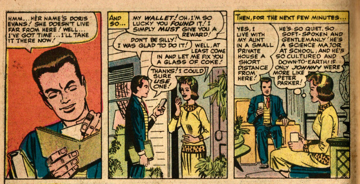
Karen is about 99% convinced that I’m really Daredevil! But, she still hasn’t said she’ll marry me!

Next to the credits, we learn Stan had scripted 7 pages before taking a vacation, and that Denny O’Neil finished the script.

We met Dennis O’Neil on the final two issues Ditko’s Dr. Strange, his first comics work. He won’t be at Marvel long. He’ll go on to pretty good things at the Distinguished Competition.
Foggy enters a costume shop featuring various superheroes and villains. Recall how we saw a lot of superhero sculptures from Wally Wood to show off his takes on the characters; this is Romita’s chance to show he’s qualified for a variety of titles. Unfortunately Wood left before trying his hand at other Marvel characters.
Romita will be with Marvel for the rest of his days, and have generally more positive things to say about Stan and their relationship than the artists we’ve been seeing up until now. And Romita will get plenty of chances in the future to draw the characters he’s depicting here.
Continue reading “Daredevil #18”


